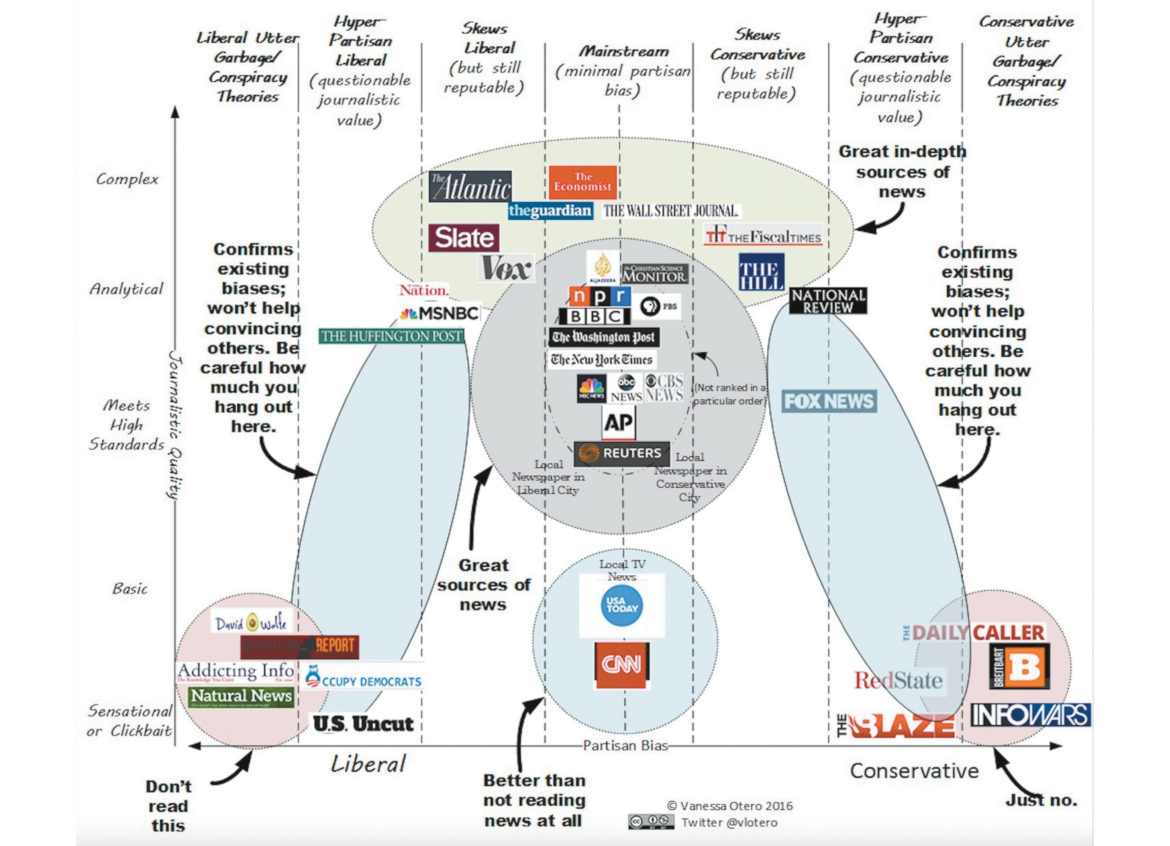
 This chart, created by attorney Vanessa Otero, inspired spirited discussions in news sources across twitter and Facebook.
The chart shows a range of Partisan Bias – liberal to conservative – with mainstream media like ABC/CBS/NBC/PBS in the middle. The graphic also represents Journalistic Quality – with complex and analytical sources like The Economist at the top and more basic, easy to understand sources like USA Today closer to the bottom.
The very bottom of the chart is Sensational or “Clickbait” – online teasers readers click to go to another website.
To read more about the reasoning and methodology behind the chart check out Ms. Otero’s blog at allgeneralizationsarefalse.com.